Level: IELTS Academic Writing Task 1
Task type: Combined chart
Recommended time: 20 minutes
Word count: At least 150 words
Task
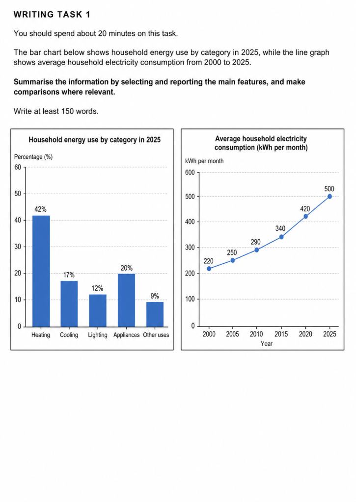
The bar chart below shows household energy use by category in 2025, while the line graph shows average household electricity consumption from 2000 to 2025.
Summarise the information by selecting and reporting the main features, and make comparisons where relevant.
Write at least 150 words.
How to approach this task
Start with a short introduction that paraphrases the question.
Then write an overview. Your overview should mention the two biggest general features:
- heating accounted for the largest share of household energy use in 2025
- average household electricity consumption increased steadily between 2000 and 2025
After that, describe the bar chart first. Group the categories logically. You could mention the highest figure first, then compare the middle categories, and finally describe the smallest figure.
Then describe the line graph. Focus on the overall upward trend and mention the starting and ending points. You should also note that the increase became stronger in the later years, especially after 2015.
Because this is a combined chart, do not treat it like two completely separate tasks. The visuals are linked by the topic of household energy, so your response should feel connected.
Do not give opinions. Do not explain why energy use changed. Do not add information that is not shown in the charts.
Useful language
Introducing the visuals
- The bar chart shows…
- The line graph illustrates…
- The bar chart compares…, while the line graph shows…
- The two charts present information about…
Writing an overview
- Overall, it is clear that…
- Overall, the most noticeable features are that…
- In general, heating accounted for the greatest share…
- It can also be seen that electricity consumption rose over the period shown.
Describing proportions
- accounted for
- made up
- represented
- comprised
- the largest proportion
- the smallest share
- just under a fifth
- slightly more than
- considerably higher than
Describing trends
- increased steadily
- rose gradually
- climbed from … to …
- showed an upward trend
- experienced a marked rise
- remained below
- reached
- by the end of the period
Useful comparison phrases
- by contrast
- whereas
- while
- compared with
- in comparison
- respectively
- was more than double
- was significantly higher than
Practice task
Write your own answer in at least 150 words. Try to include:
- a clear introduction
- a clear overview covering both visuals
- the main features of the bar chart
- the main trend in the line graph
- accurate figures
- clear comparisons
- no personal opinion
- no invented details
What a strong answer should include
A strong IELTS Task 1 answer for this question should:
- clearly paraphrase the task
- include a meaningful overview
- identify the highest and lowest energy-use categories
- describe the steady increase in electricity consumption
- use accurate data from the charts
- organise the information logically
- use a good range of grammar and vocabulary
Example answers
Target Band 6.5 model answer
The bar chart shows household energy use by category in 2025, while the line graph shows average household electricity consumption between 2000 and 2025.
Overall, heating used the largest proportion of household energy in 2025, whereas other uses accounted for the smallest share. It is also clear that average household electricity consumption increased steadily throughout the period shown.
Looking first at the bar chart, heating made up 42% of household energy use, which was by far the highest figure. Appliances were the second largest category at 20%, followed by cooling at 17%. Lighting accounted for 12%, while other uses represented the lowest proportion, at just 9%.
Turning to the line graph, average household electricity consumption rose from 220 kWh per month in 2000 to 500 kWh in 2025. The increase was gradual at first, reaching 250 kWh in 2005 and 290 kWh in 2010. It then continued to rise to 340 kWh in 2015, before increasing more sharply to 420 kWh in 2020 and finally 500 kWh in 2025.
Why this is around a target Band 6.5
This answer would be around a target Band 6.5 because it:
- covers both charts clearly
- includes a relevant overview
- selects the main features accurately
- is logically organised
- uses correct data
However, the language is fairly direct and repetitive in places, and the vocabulary range is solid rather than especially sophisticated.
Target Band 8.0 model answer
The bar chart compares the proportions of household energy used for five different purposes in 2025, while the line graph illustrates changes in average monthly household electricity consumption between 2000 and 2025.
Overall, heating accounted for by far the largest share of household energy use in 2025, whereas other uses made up the smallest proportion. At the same time, average electricity consumption showed a clear upward trend across the 25-year period, with the sharpest growth occurring after 2015.
In terms of energy use by category, heating was dominant at 42%, which was more than double the figure for appliances, the second largest category, at 20%. Cooling represented 17%, while lighting was lower at 12%. The remaining category, other uses, accounted for only 9%, making it the least significant source of household energy demand.
With regard to electricity consumption, the average figure rose steadily from 220 kWh per month in 2000 to 250 in 2005 and 290 in 2010. It then climbed further to 340 kWh in 2015 before increasing more markedly to 420 in 2020 and reaching a peak of 500 kWh in 2025.
Why this is around a target Band 8.0
This answer would be around a target Band 8.0 because it:
- gives a clear and well-judged overview
- selects and highlights the key features skilfully
- groups and compares information effectively
- uses a wider and more flexible range of vocabulary
- shows strong grammatical control and varied sentence structures
It is more concise and more analytical than the Band 6.5 version.
Quick writing tips for students
Keep your answer factual and organised.
Do not write about every number in isolation.
Do not give opinions or explanations.
Make sure your overview includes both charts.
Use exact figures where useful, but focus on the main features.
