Level: IELTS Academic Writing Task 1
Task type: Multiple pie charts
Recommended time: 20 minutes
Word count: At least 150 words
Task
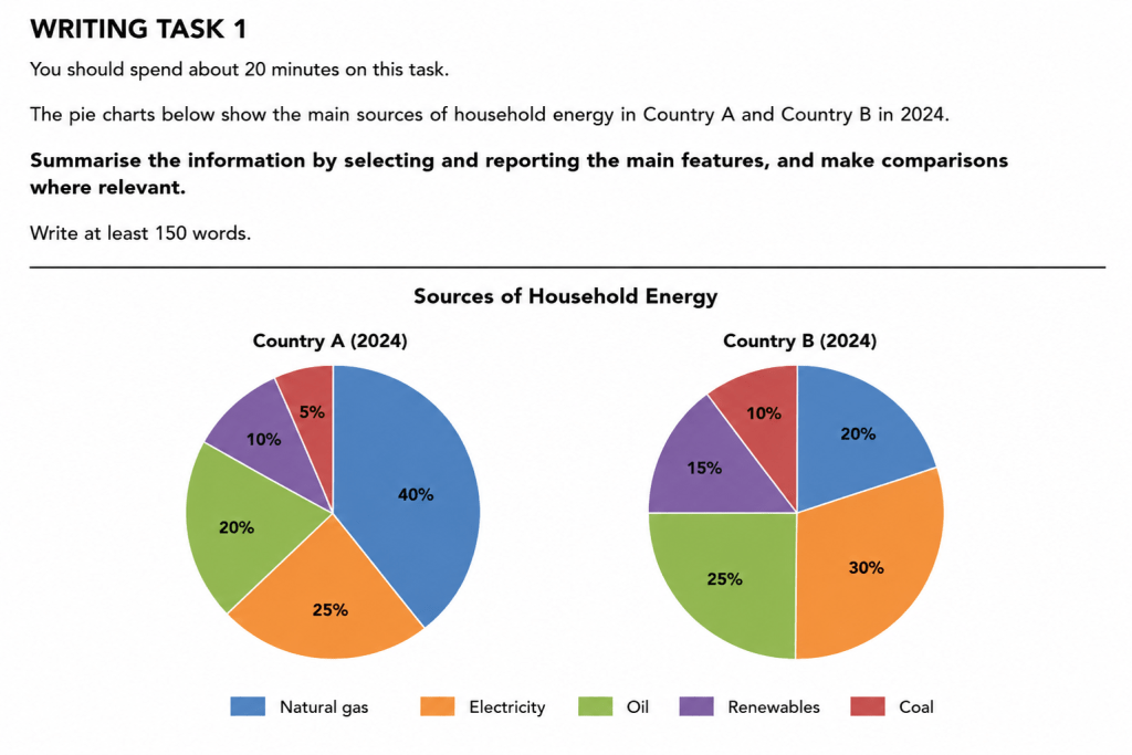
The pie charts below show the main sources of household energy in Country A and Country B in 2024.
Summarise the information by selecting and reporting the main features, and make comparisons where relevant.
Write at least 150 words.
How to approach this task
Start with a short introduction that paraphrases the question.
Then write a clear overview. For this task, the most important overall point is that the two countries relied on different main sources of household energy. In Country A, natural gas was the largest source, while in Country B, electricity was the largest source. Coal was the smallest source in both countries.
After that, describe Country A. Mention that natural gas made up the largest share, followed by electricity and oil. Then group the two smaller sources: renewables and coal.
Then describe Country B and compare it with Country A. Explain that electricity was the largest source in Country B, followed by oil and natural gas. Renewables and coal were both higher in Country B than in Country A.
Use comparison language throughout. Do not simply list the percentages one by one. A strong answer should compare the two countries and highlight the biggest similarities and differences.
Do not give opinions. Do not explain why the countries use different energy sources. Do not add extra information that is not shown in the charts.
Useful language
Introducing the charts
The pie charts show…
The charts compare…
The two pie charts illustrate…
The data shows the main sources of household energy in two countries.
Writing an overview
Overall, the two countries relied on different main sources of household energy.
Overall, natural gas was the dominant source in Country A, whereas electricity was the largest source in Country B.
Coal accounted for the smallest proportion in both countries.
Country B had a more even distribution of energy sources than Country A.
Describing proportions
accounted for
made up
represented
comprised
formed the largest share
contributed the smallest proportion
was the dominant source
was the least-used source
Useful comparison language
whereas
while
in contrast
by comparison
compared with
slightly higher than
considerably lower than
twice as high as
half as much as
Useful grammar
Natural gas accounted for 40% of household energy in Country A.
Electricity made up the largest share in Country B, at 30%.
Oil represented 20% in Country A, compared with 25% in Country B.
Coal was the smallest source in both countries.
The proportion for natural gas in Country A was twice as high as in Country B.
Practice task
Write your own answer in at least 150 words. Try to include:
a clear introduction
a clear overview
the largest and smallest sources
accurate percentages
clear comparisons between the two countries
no personal opinion
no invented details
What a strong answer should do
A strong IELTS Task 1 response to these pie charts should:
- Give a clear overview of the biggest differences.
- Compare the two countries instead of describing them separately without connection.
- Identify the largest and smallest categories.
- Use percentages accurately.
- Group smaller or similar categories where possible.
- Avoid explaining reasons that are not shown in the charts.
Example answers
Target Band 6.5 model answer
The pie charts show the main sources of household energy in Country A and Country B in 2024.
Overall, the two countries used different main sources of household energy. Natural gas was the largest source in Country A, while electricity was the biggest source in Country B. Coal was the smallest source in both countries.
In Country A, natural gas accounted for 40% of household energy, making it the largest category. Electricity was the second most important source, at 25%, followed by oil at 20%. Renewables made up 10%, while coal represented only 5%.
In Country B, electricity was the largest source of household energy, at 30%. Oil was slightly lower, at 25%, and natural gas accounted for 20%. Renewables made up 15%, which was higher than in Country A. Coal was again the smallest category, although its share was 10%, double the figure for Country A.
Why this is around a target Band 6.5
This answer covers the task clearly and includes a relevant overview. It identifies the largest and smallest categories and gives accurate percentages.
However, the language is fairly direct and repetitive. The structure is clear, but the comparisons are quite simple, and the answer mostly describes each country in turn. This makes it suitable as a Target Band 6.5 model.
Target Band 8.0 model answer
The pie charts compare the main sources of household energy in Country A and Country B in 2024.
Overall, the two countries showed different patterns of household energy use. Country A relied most heavily on natural gas, whereas electricity was the leading source in Country B. Coal made up the smallest proportion in both countries, although its share was higher in Country B.
In Country A, natural gas was by far the dominant source, accounting for 40% of household energy. Electricity represented a further 25%, while oil contributed 20%. The remaining two categories were much smaller, with renewables at 10% and coal at just 5%.
Country B had a more balanced distribution. Electricity formed the largest share, at 30%, followed by oil at 25% and natural gas at 20%. Renewables accounted for 15%, five percentage points higher than in Country A. Coal remained the least-used source, but at 10%, its share was twice as high as the figure recorded in Country A.
Why this is around a target Band 8.0
This answer gives a strong overview and highlights the most important similarities and differences. It does not simply list the data; it compares the countries and groups the information logically.
The vocabulary is more flexible, with phrases such as relied most heavily on, dominant source, represented a further, more balanced distribution, and least-used source. The grammar is controlled, and the response uses accurate comparisons without adding information that is not shown in the charts.
Rubric note for students
In the real IELTS exam, your final score is not decided only by word count or advanced vocabulary. IELTS Writing Task 1 is assessed through four areas:
Task Achievement – Did you cover the task properly and highlight the key features?
Coherence and Cohesion – Is your answer clear, logically organised and well linked?
Lexical Resource – Is your vocabulary accurate and varied enough?
Grammatical Range and Accuracy – Do you use a range of sentence structures accurately?
For Task 1, write at least 150 words, spend about 20 minutes, and write in connected paragraphs, not notes or bullet points.
Quick writing tips
Always include an overview.
Do not describe each slice separately without comparison.
Mention the biggest contrast: natural gas was highest in Country A, while electricity was highest in Country B.
Mention the smallest category: coal was lowest in both countries.
Use exact percentages where useful.
Do not explain why the countries used different energy sources.
Keep the answer factual and neutral.
